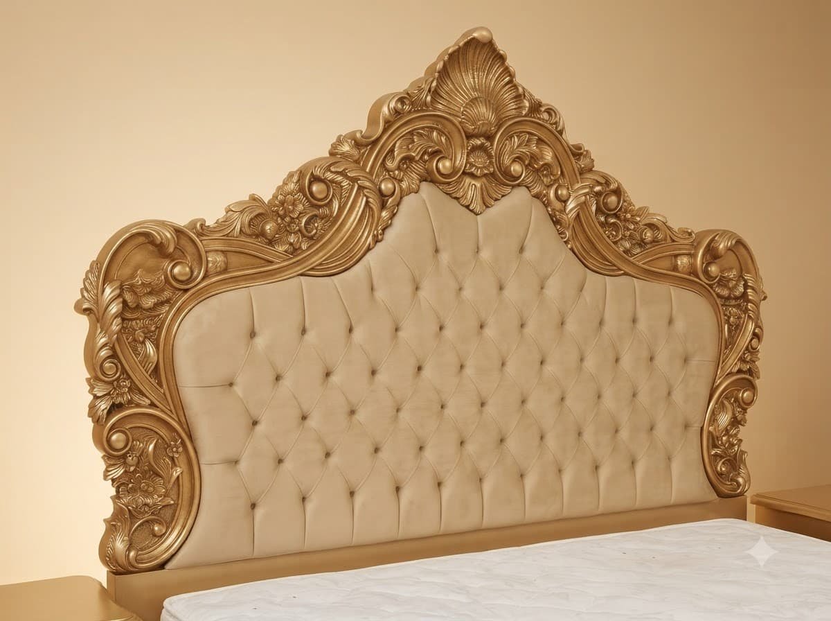
Matching the Velvet to the Gold on Purpose
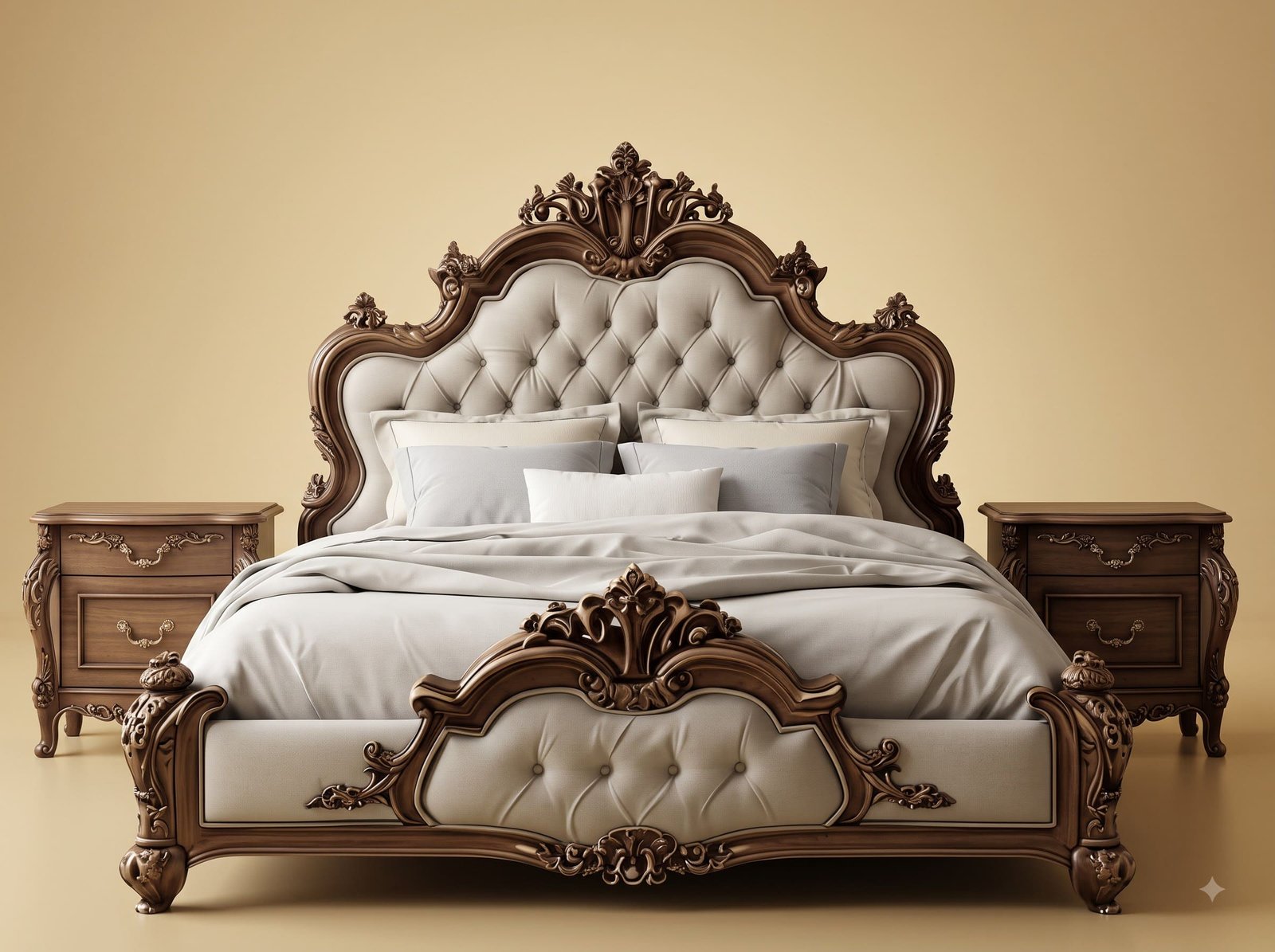
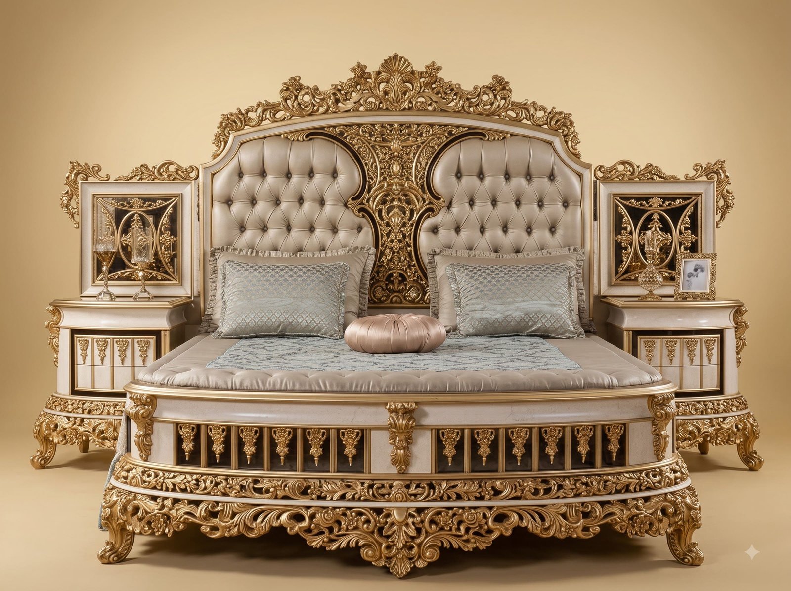
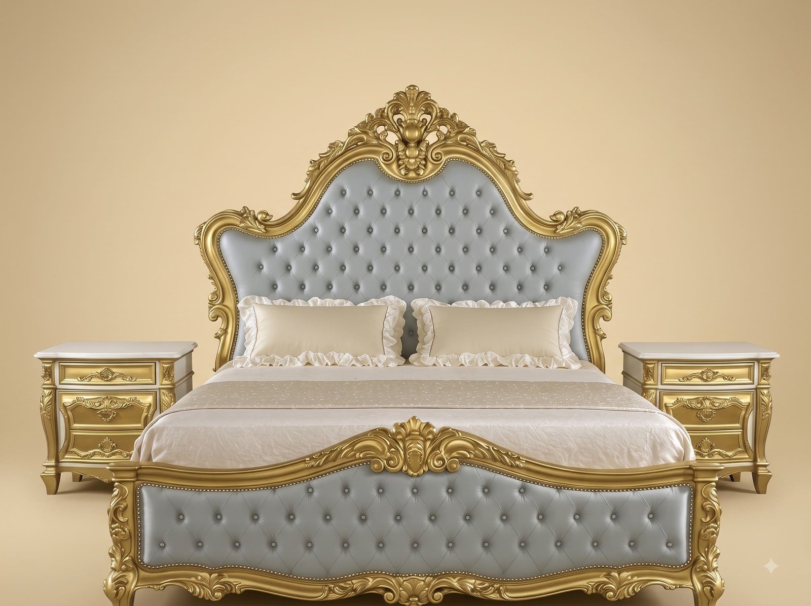
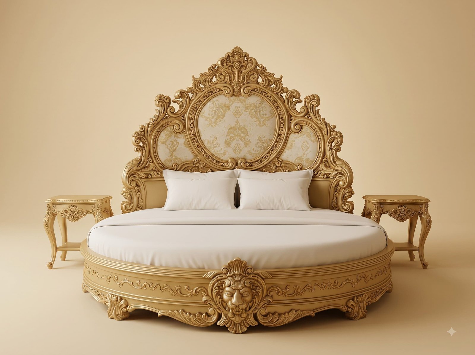
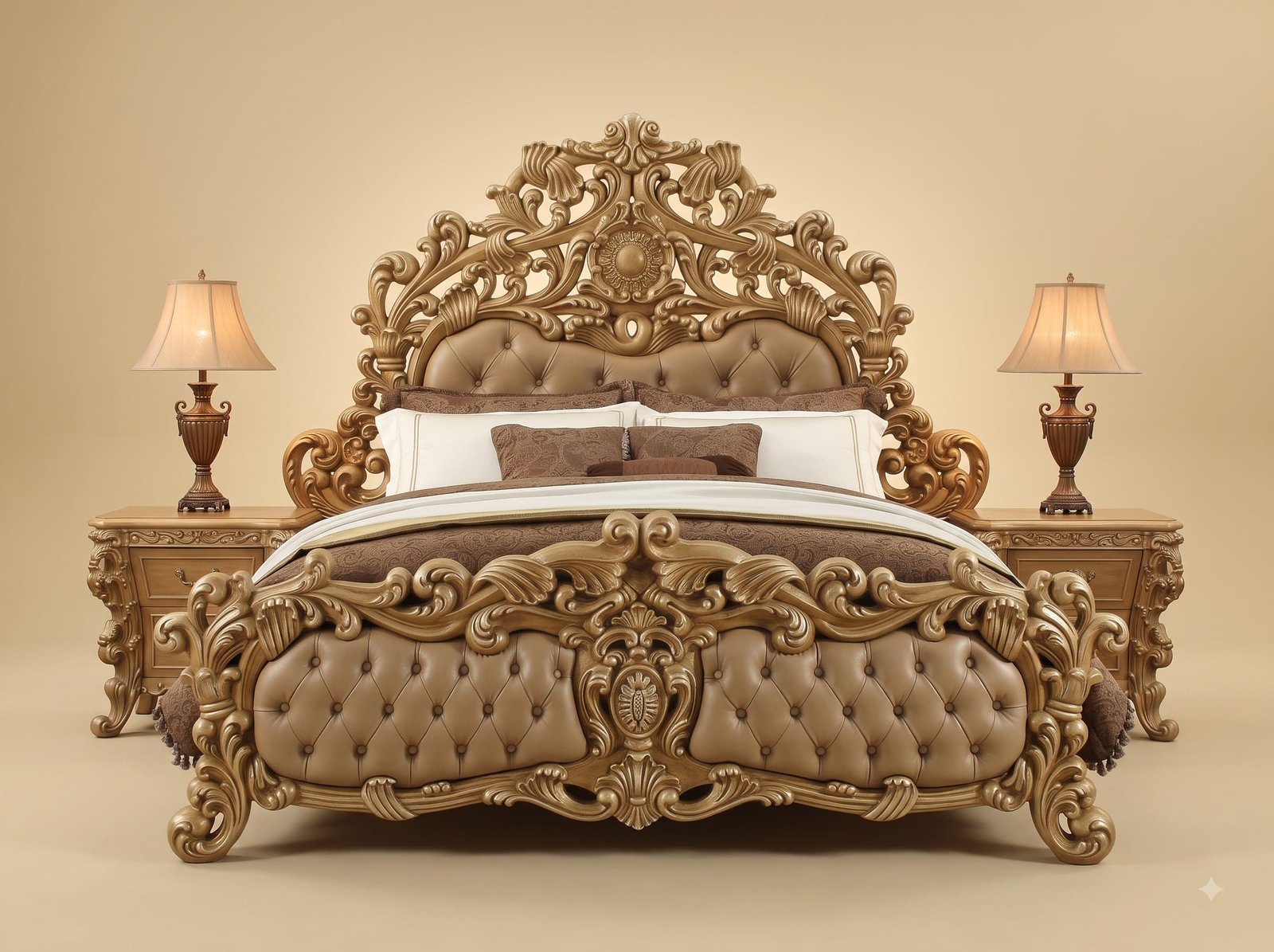
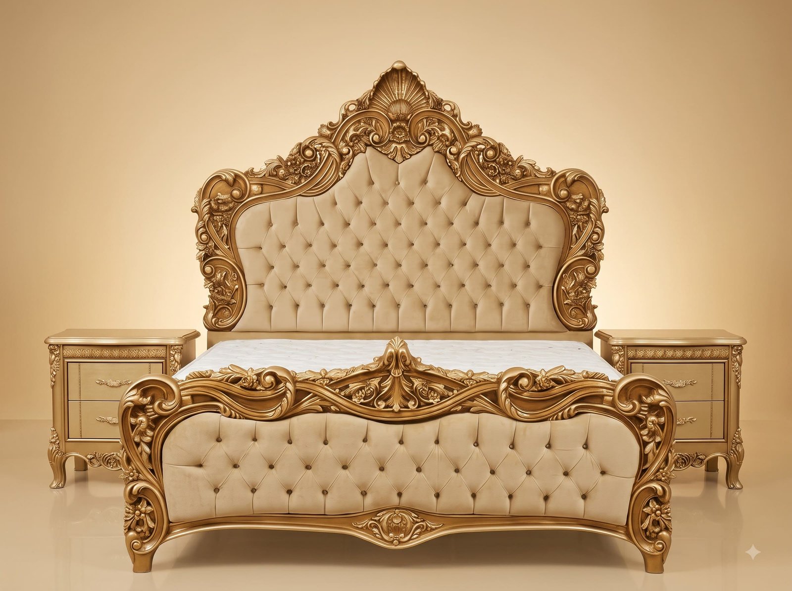
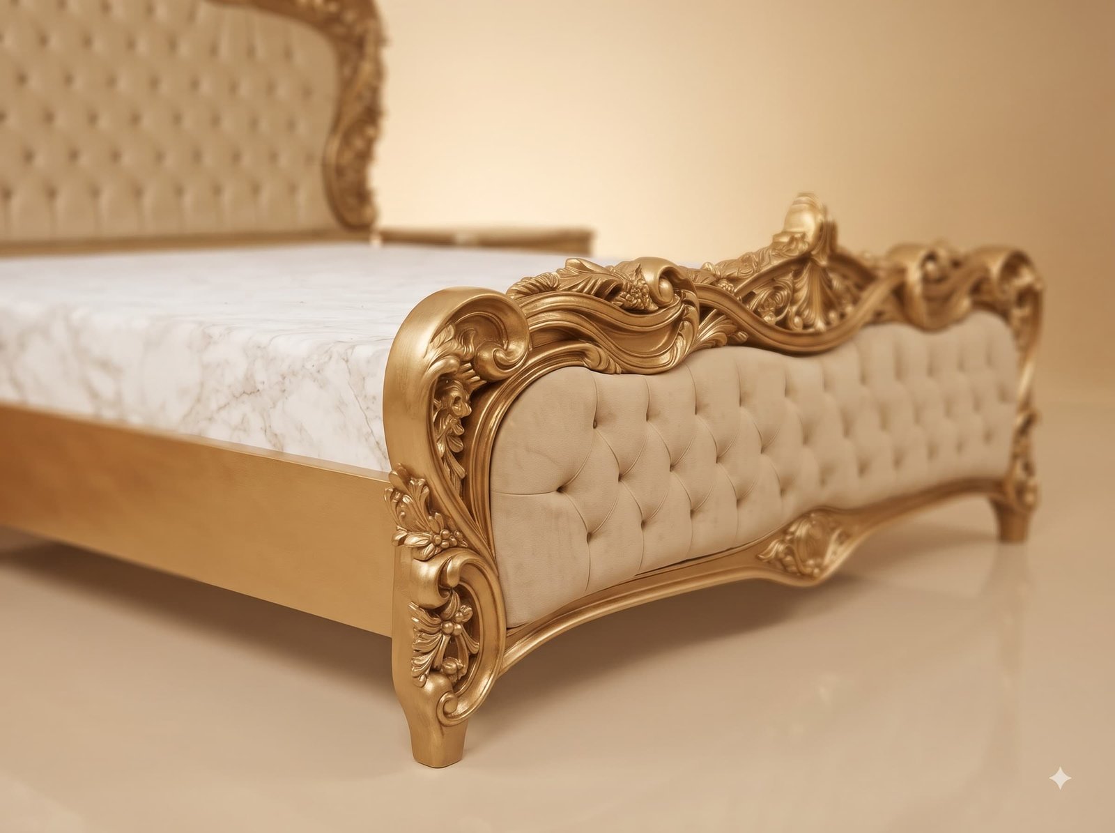
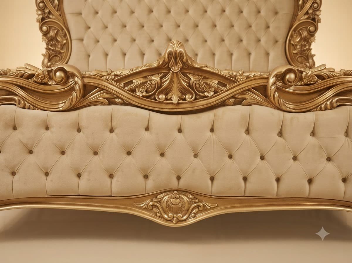
The usual instinct with a gilded frame is to set something contrasting inside it, because contrast makes the carving obvious. This bed takes the opposite route and matches the upholstery to the metal. It is the harder version to execute and it is the more interesting result, because the piece stops reading as a frame containing panels and starts reading as one continuous carved and quilted object. The reason it does not go flat is physics rather than colour: gold is a specular surface that throws sharp highlights off every raised scroll, while velvet pile is diffuse and scatters light gently across the tufted diamonds. Two materials in the same tone, behaving completely differently under a bedroom lamp.
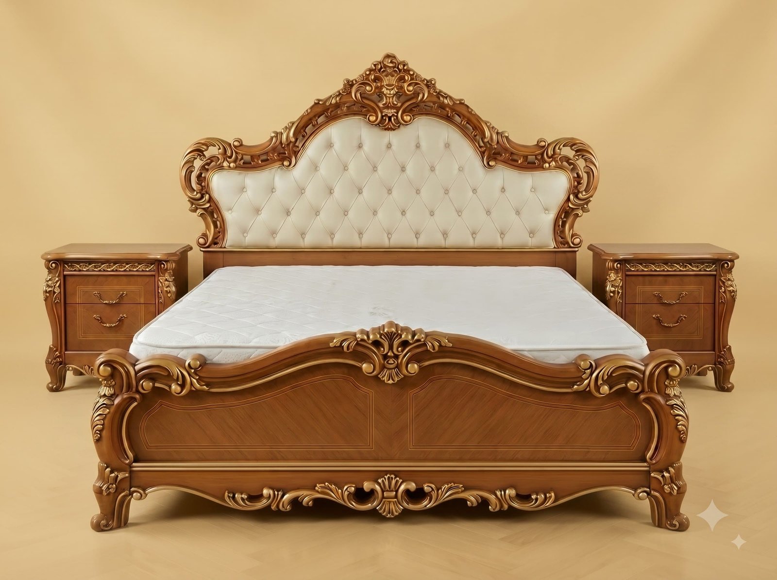
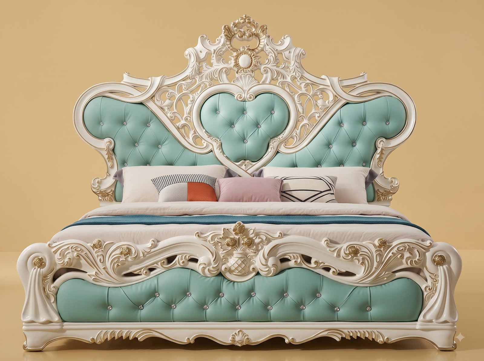
The crest is the other deliberate choice. It is carved tall and made to project forward from the wall plane instead of sitting flush, which is more work and uses considerably more timber, because the shell and the scrolls either side have to be cut from stock deep enough to stand proud. The payoff is a shadow line behind the crown that changes through the day as the room light moves, giving the top of the bed depth that a flat crest cannot have. All of it is carved, gilded and upholstered by hand by master Indian artisans, and the photographs on this page show the actual piece.
 Ask Price On WhatsApp